First impressions matter, especially during an initial meeting with a prospective customer. They matter because it’s your best chance to convince customers that your solution can deliver superior value. But exactly how you communicate your superior value is a challenge when a customer seems unmotivated to change or automatically equates value with getting a great deal.
So your first impression needs to grab the customer’s attention by demonstrating a compelling value story that ties your solution to their overall business success. A great way to tell the story is with a compelling value chart. In our experience, the essential characteristics of an effective value chart are:
- Easy to Understand
- Shows Them the Money
- Highlights Your Unique Advantages
- Opens a Discussion About the Customer’s Issues
- Are Easy to Tweak to Reflect the Customer’s Issues (and Your Unique Advantages)
Below are five different value charts that have been proven effective based on our experience:
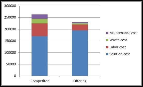
1. The Competitor Hidden Cost Chart
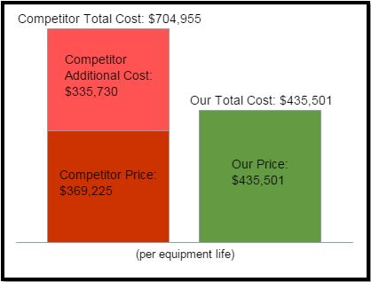
The best thing about this chart is that it tells a nice “you get what you pay for” story. Using this, a sales person can confidently make the claim that their solution actually costs less than the competitor when all the true related operating costs are factored in. A chart like this will certainly catch the customer’s attention and lead to questions about how the additional costs were calculated, which should be provided in other charts or tables.
It’s important to keep in mind that although this looks similar to TCO (total cost of ownership) charts there is a difference. Here, the competitor additional cost is really comparative, not absolute. For example, if part of the competitor additional cost is higher fuel costs, then the amount included is the difference between the competitor and our offering – as opposed to the totals for both. In other words, the fuel costs for our offering would not be included in the green bar on the right.
2. The Economic Value Estimation (EVE) Chart
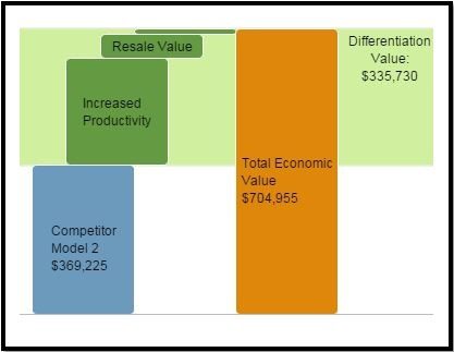
This chart is an excellent choice if your customer is already familiar with value charts such as large OEMs who buy from specialty materials and component manufacturers. Based on the Economic Value Estimation (EVE) methodology, this chart’s key feature is the highlighted differentiation value area (light green) and $ amount, which immediately steers the conversation away from your offering price (in fact offering price is absent from this chart).
It also sets the stage for a deeper conversation about the specific sources of the differentiation value, namely the specific value drivers (dark green steps). As you can see in this example, increased productivity is a huge value contributor, therefore an obvious place to begin the value discussion.
3. The Value to Customer Chart
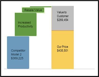
This chart is a recent innovation developed after feedback from the LeveragePoint user community. It combines the best attributes of the previous two charts, namely the specific value drivers and side-by-side price comparisons.
A key feature of this chart is explicitly calling out “value to customer”. Using this, the sales person can confidently say that the customer gains much more economic value (shows them the money) by using our offering even at a slightly higher price.
4. The Multi-Year Financial Chart
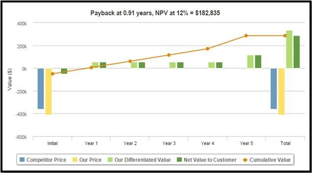
This chart works best when your offering is a multi-year capital expenditure. It combines the traditional financial-based investment approach with a value dimension that appeals to financial decision makers because it uses standard metrics of payback and net present value (NPV). So it’s a format that is easily understood by these stakeholders.
This chart clearly distinguishes initial outlays versus annual costs/value to customer. At the far right there is a dark green bar which shows total value to customer, which can lead to a more in-depth discussion about specific value drivers.
5. The Total Cost of Ownership (TCO) Chart
Total cost of ownership (TCO) charts are widely used across industry to show cost comparisons between two (as well as three or more) alternative solutions. All acquisition-related and operating costs are stacked up and displayed side-by-side. The visual implication is that the shortest stack wins and therefore this makes the value story telling a very easy task.
So for simple annualized cost comparisons this chart is excellent. However one drawback is that it does not handle either revenue value drivers, or less tangible drivers, like risk, very well.
In Conclusion
Choosing which chart is best for your offering depends in part on your customer and sales process. Some field testing and refinement may be required before you hit upon the right portfolio of charts. Often we find that chart styles evolve over time, so be open to continual improvement.
Therefore, the right marketing and sales tool is essential for producing these types of charts on a timely basis and linking them to other materials. LeveragePoint provides a cloud-based solution that enables marketers to quickly publish and manage value propositions on a large scale.