 My previous blog post, 5 Value Charts that Make an Awesome First Impression, generated enough interest in the value community to deserve a follow-up. This time I want to illustrate a specific example of how to prepare different kinds of value charts.
I’ll use a simple example of dish washing liquid detergent, where we want to communicate the superior value of a premium brand versus a so-called bargain brand. To summarize the situation, the premium brand costs more per bottle, but is “Actually CHEAPER to USE … than the BARGAIN brand!” This was superbly illustrated in a classic TV commercial comparing the number of dishes washed to the amount of detergent used (more details here).
How can we tell this value story using real numbers?
This is exactly where most B2B marketers chicken-out. While many claim differentiators in their marketing messages, few dare to actually quantify it for their customers. Often they resist because of fear – fear of using the wrong numbers. Or, fear of not being able to explain the numbers.
Well, the task isn’t really all that difficult. So let’s head to the kitchen sink and quantify the value of our dish detergent. We start with a few comparative metrics.

With this data we can tell the value story in three different ways/charts. See below.
Approach 1 – Using a customer metric
A customer metric means measuring value not by the price per bottle, but by a metric that is more meaningful for the customer and addresses an important need. For dish-washing customers who loathe running out of soap when confronted with an ugly sink full of dirty dishes, one possible metric is “number of dishes per bottle” – because more dishes per bottle directly reduces the risk of running out.
OK, let’s pause here to emphasize the importance of a customer metric versus a price metric (cost per bottle). It is absolutely essential that the marketer intimately know what their customer needs are. In our experience many B2B marketers often don’t have a clear enough idea of that. In other words, they know lots about their bottles, but much less about their customers’ sinks and dishes.
By using the data above and converting performance on a per sink basis, we get the first chart, which we call the Cost chart. The red bar is the bargain brand, which costs 13 cents a sink. The green bar is our premium brand – it only costs 11 cents a sink. Cue the message: “Actually CHEAPER to USE … than the BARGAIN brand!”

The specific math for this example is for the competitor $1.99 per bottle, divided by 300 dishes, multiplied by 20 dishes per sink. Likewise, for the premium brand, it’s: $2.99 / 550(20).
Approach 2 – Showing equivalent spend
This approach requires a little more math, but doing so allows you to show value on a per bottle basis. This is sometimes necessary when dealing with procurement functions who really do think in terms of bottles rather than sinks – and whose performance is measured that way.
Here we compare the $1.99 bargain brand bottle (red bar) versus the $2.99 premium brand bottle (green bar). But above the red bar is a yellow bar labeled “Additional Spend” of $1.66 and when you add that to the $1.99 price, you get a total spend of $3.65.

That $3.65 represents how much of the bargain liquid you would need to buy to be equivalent to ONE bottle of premium liquid. It takes almost two bottles of the bargain liquid (1.83 bottles to be exact) to do the work of just one bottle of premium.
To say it another way, it costs $3.65 (1.83 bottles) worth of bargain liquid detergent to wash 550 dishes versus JUST ONE bottle of the premium liquid detergent at $2.99.
Or, you can say it costs $1.99 (ONE bottle) worth of liquid detergent to wash 300 dishes versus only $1.63 worth of premium liquid, because you would only use about half that bottle (54.5% to be exact).
Like I said, this approach requires a little more math, yet still proves that the premium brand is, economically-speaking, “Actually CHEAPER to USE … than the BARGAIN brand!”
Note the subtlety here with the “per bottle” price metric. Clearly, a bottle is not a bottle. There are 300-dish bottles and 550-dish bottles. Again to understand, appreciate, and communicate true value, you need to look beyond the bottle and consider the stuff inside and especially why it matters to the customer.
Approach 3 – Showing the total spend (TCO)
This is the easiest and perhaps most widely used approach in B2B marketing. But it has limitations.
Total Cost of Ownership (TCO) is usually expressed as an annual (per year) metric. It works because both customer and pricing metrics can easily be expressed on an annual basis. In this example, all you need to know is how many sinks/dishes are washed per year. Note the second row, “Detergent cost per year,” where we converted our usage rates above to an annual basis.
You also need to bring in other costs (“T” is for Total), so we need to account for annual water and sponge usage. For simplicity we kept the water and sponge costs constant, but sometimes there are differences in other cost categories in a TCO analysis.

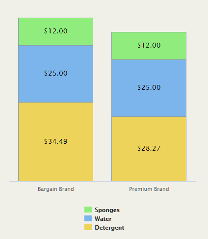
We can use the data above to graph it this way. TCO charts are easy to read because the lower stack wins, i.e., has less total cost. So for this example, the annual cost of using the bargain brand to wash dishes is $71.49 a year whereas the premium brand is less: $65.27. Once again, on an annual “all-in” cost to clean dishes, the premium brand still remains “CHEAPER to USE.”
Note on TCO limitations – TCO works well if the comparisons are strictly tangible costs. However it cannot show more sophisticated value stories that include increasing top-line revenue, reducing business risk or other less tangible sources of value. In some cases, these alternate sources of customer value are essential to the value story.
In Conclusion
We demonstrated three different ways to use customer value data to turbocharge a “CHEAPER to USE” story. It’s fair to say it would be overkill to use all three in this situation. The choice comes down on which fits best with your overall communication strategy and sales process.
Regardless of which way you show it, value stories are much better with numbers than without. A quantitative approach signals a strong commitment to your customer’s success. It opens doors. It pushes aside common purchasing objections.
The time and effort required to create these stories is minimal. The calculations are easy to set up. Switching between charts is virtually effortless with the right software.
