 As many of us know, the track record for new product launches isn’t a pretty picture. Frankly, the success rate has been dismal for a long time – only 1 out of 4 new products ever reach their revenue or profit target. One recent report says one key factor is the quality of the value story. In other words, you can do everything right in terms of innovation and rollout, but miss if you fail this critical step.
Before we go any further, let’s clearly define what Value really means. And for that, I want to quote one of our good friends, Mike Wilkinson from Axia Value Solutions. He’s written a number of excellent articles for the LeveragePoint blog. And I strongly recommend his latest one, where he states an obvious, but often overlooked point:
Our customers define customer value, not us.
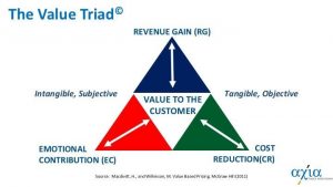 I say often overlooked – because in my own experience working with product managers, many of whom have an engineering background, they tend to have a bias in perceiving value as an objective, scientifically proven concept. It’s truly a revelation for them to realize that it’s not – it’s really a combination of objective and subjective factors. Mike frames this in what he calls the Value Triad. What it means is that the customer thinks of value in terms of economics – revenue gain and cost reduction – as well as emotions, like trust or risk. The lesson here is: you need to get inside your customer’s brain to write an effective value story.
Ineffective value stories miss the mark in the following ways:
-
- Too product-centric. No surprise because that’s where you have the most reliable data. But you need to get beyond that.
-
- Not tied to what customers care about. Unfortunately, many product managers don’t get enough customer contact and it shows. Their understanding of customer need and pain points is limited or second-hand. Find out what customers really care about, not what you think they should care about.
-
- Too complex. Even when all the elements of a good value story are solid, it can miss if the customer is overwhelmed or confused by TMI.
- Not tested in the field. This, for me, is the most fatal mistake, because all the other misses above can be fixed with a little testing and iteration. In many companies I interact with, there is relatively low collaboration between product and sales functions – either by design or tradition. Our most successful LeveragePoint customers are those who increase that collaboration – and testing value stories is a great way to do that.
Now, let’s look at an example of a successful story. Here’s one that everyone should know. Take the GEICO lizard. Most of us can recite his value message from memory.
“15 minutes could save you 15% or more on car insurance.”
- Is it too product specific? No.
- Is it tied to what customers care about? Yes.
- Is it too complex? No, it’s elegant.
 Just imagine what some product managers might do with that message. They may whip out a process map and elaborate: well, on average it would take between 13.5 and 22.75 minutes (depending the time of day and location). On average the final cost difference ranged between 14.9 and 19.82 percent…etc. etc. I’m exaggerating (but just a little bit) to make the point. It’s interesting to note that Geico is owned by none other than Warren Buffet, who has made a fortune by understanding what value really is.
Value messages are the backbone of the narrative. They are the two, three or four things you tell the buyer which connects your product to their needs. How do you express that?
Here are a few B2B value message examples I extracted from different value stories we’ve written:
-
- Reduce aftermarket warranty costs – Reduce existing after-market warranty claims and returns because of better performance against chipping, rust, etc.
-
- Reduced compliance event risk – A streamlined automated system reduces risk of a compliance event occurring
-
- Reduce NPT due to issues caused by fluid contamination – New formula eliminates the most common types of contamination that causes shut down, therefore reducing costly non-productive time
- Increased Revenue from Greater Productivity – Bucket size and configuration result in faster loading time for trucks, improved cycle time and less passes
Writing is an art form and to some extent quality is in the eye of the beholder. Yet, two key things you need to ensure are, 1) the message is crystal clear; and 2) you use the language of the customer or customer industry.
Now, I want to turn my attention to the visuals. Specifically, the charts you use to show your quantified value. This is a deep topic because there are alternate ways to show it: bar charts, pie charts, line chart, and so on. Two alternatives I’ll compare now are Total Cost of Ownership (TCO) chart and Value Stack. Note that in these examples we are using the exact same data.
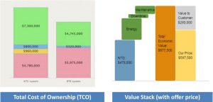
The chief advantage of the TCO chart is its simplicity. Competitor on the left, us on the right. Lower cost is good. Therefore: if your bar is lower you are better. Done.
But TCO has some drawbacks. One is that it is limited to showing only costs (TCO, right?) – so if you have a revenue advantage you can’t show it this way. Another limitation is that TCO works best with direct apples to apples comparisons, in other words – direct competitors. Often your competitive reference isn’t that simple. You may have a totally new innovation, where you are competing with a status quo situation – which technically has no direct cost. This may force you to do a little mental gymnastics to show the left bar cost, but at that point you are sacrificing the simplicity.
So . . . a more robust chart alternative is the Value Stack (on the right). For those of you who know Tom Nagle’s Economic Value Estimation or EVE method, this is very familiar. Unlike TCO, this chart displays differential value, not total costs.
For example, do you see this dark green bar called “Energy”? That is the net difference between the two light green bars on the TCO chart – the $7.3 million (total cost of competitor) versus the $4.745 million (total cost of ours). The difference amounts to $2.5 million which is what the dark green Energy bar is showing. This is differential value – the fact behind a key value message. That’s why it’s a superior chart to support a value discussion. However, you do need to get comfortable with it.
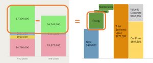
We at LeveragePoint have upgraded Tom Nagle’s original EVE chart to include this last bar: Our Price, and the bar above it which shows the net value to customer – in this case $280,000. That’s how much better off the customer is doing business with you. The bottom-line number. In fact, that’s really the only number you need to show – and you can make a simple graphic or headline around that number.
One insight we’ve come to appreciate lately is that when it comes to value stories – one size does NOT fit all. You need small, medium and large versions of the same basic story, because value stories are used to support your Sales team in their discussions with the customer throughout the buying cycle.
In summary: Get inside your customer’s head. It’s a collaborative process. It’s an agile process – Don’t Wait, Iterate! Avoid one-size fits all. Use a digital platform to manage content – A shared platform is essential to scale the development of digital case studies that can be customized and presented in a variety of formats.