There are some pretty good B2B value spreadsheets out there. Clear inputs and assumptions. Well documented supporting notes and sources. Nice scenario analyses.
There are some pretty smart creators of these spreadsheets, including product managers and other presales professionals. The best creators are adept at walking through their analyses clearly and persuasively. They think about how they will present their numbers as they lay them out in rows and columns.
But can anyone else use or understand their spreadsheets? Frequently the answer is no. Because the spreadsheets are usually designed with an analytical objective. Their purpose is to make sure that the math is correct and can be defended by the spreadsheet’s author. This is a respectable ambition that makes the spreadsheet author look smart, but it is not a primary organizational goal that drives sales performance.
Spreadsheet authors, including product managers and other presales professionals, need leverage from other members of the customer-facing team. Value Propositions deliver sales results by providing a tool for effective customer conversations. B2B sales leaders are looking for Value Propositions that draw a sales user or a sales audience to a persuasive, memorable conclusion. The content and the layout should be designed to support sales conversations with customer economic insights. Designing Value Propositions that are useful for B2B sales should be the goal.
Today’s spreadsheets often miss this target because the bottom line – the headline financial answer – doesn’t stand out, isn’t labelled intuitively or isn’t appropriate to the situation. Just as often, they miss because the way that customer value is created isn’t shown in a clear, simple, memorable graph.
To the Bottom-Line and Beyond: Economic Value, TCO, ROI and Breakeven. At the heart of every Value Proposition there is always a single, bottom-line numerical answer. It answers a question, “If a customer decides to buy my product or solution, how much money does the customer make by doing so, net of all costs?” Sometimes the answer is expressed as “Value to Customer” or “Net Economic Value.” Sometimes it is expressed as “Financial Impact,” “Savings” or “Net Savings.” The answer is always expressed in a currency: Dollars, Euros, Pounds, Yen, Yuan, perhaps someday in bitcoin. There are a few things to notice about the number that answers the bottom line question:
- To answer the question there needs to be a comparative reference point. “Compared to what?” A sales or presales user of the Value Proposition must be able to provide the competitive context for a bottom line number.
- To answer the question clearly, there needs to be an underlying unit that resonates with the customer. “Per what?” Per unit of customer output. Per year. Over the life of a contract, a project horizon or the life of a piece of equipment.
- For the Value Proposition to be useful to a customer sponsor in making the business case to buy, it needs to include prices. This may not be necessary at some points in the sales cycle, but it is almost certainly necessary prior to decision time. Regardless of the sales process, regardless of the roles of sales team members, at some point some member of the customer-facing team needs to be able to discuss value and price in the same conversation.
 This number, Value to Customer, is a critical number. But it is just a number. It doesn’t provide anyone with a sense of how value or savings are created. It doesn’t suggest natural graphics except perhaps by putting the answer in context (“we can create $y in value for you which represents an x% improvement in your EBIT.”) The number provides an answer but it doesn’t support a story, invite customer questions, provide decision-making context or stimulate a conversation.
Value Propositions need more than a bottom line. The standard approaches to providing additional information in summary form include Economic Value, TCO, ROI and Breakeven. These standard approaches and standard terms help provide further decision-making context and richer Value Proposition summaries. Standardization of the approach and standardization of language help sales become more comfortable in value selling when Value Proposition content, answers and graphics are expressed and laid out in a similar way. Standardization also helps with customer understanding, supporting sales with answers to anticipated customer questions. Graphs that go with these answers provide visual cues that make the numbers more understandable, memorable and impactful both for sales and for customers.
Choosing the Right Approach. These standard approaches convey information on where Customer Value or Savings come from, how to interpret them for decision making and how they are timed. Each of these approaches and their accompanying graphs work better in some situations than in others. In this blog, we look at each with an eye to their applicability as well as their strengths and their weaknesses.
The most useful summary information sometimes varies with the stage of the sales cycle, who from the sales team is having the customer conversation and which buyer stakeholders are involved. That said, the underlying product and customer circumstances often make some of these approaches more appropriate and useful than others. The two important questions to ask early in designing a Value Proposition are the following:
- What is the comparative reference point for the customer making a decision to buy? In short, what is the competitor?
- For disruptive solutions and for products that are used as an add-on to the current approach, the competitive reference point is usually
 best described as the status quo or the current approach. For communication purposes, it is generally clearest in this situation to portray the competing price as zero.
 - For products or solutions that directly compete with or replace another product or approach, there is a direct competitor and often more than one competitive reference point. The competitor has a price and that means a likely price comparison at some point by any customer making a decision of which product to buy.
- Many products potentially face a mix between the first two types of competitive reference points. Some sales processes face the status quo as a competitor at one point of a sales process and face a direct competitor at another point. Customers often consider whether they have the budget to make any purchase as well as which purchase to make. These distinct questions arise not only at different points in the sales cycle, but also with different customer audiences and come up more than once. A customer investing in new equipment may, at one point, consider whether to invest at all and, at another point, consider whether to buy our equipment versus a competitor’s equipment. This mix is likely for purchase decisions resulting in capital expenditure. It is also likely for software purchases or new production technology decisions (e.g. a new material) that involve change, generating upfront, installation or transition costs.
- For disruptive solutions and for products that are used as an add-on to the current approach, the competitive reference point is usually
- How does my product or solution create customer value relative to the competitive reference point? There are three primary ways that differentiated products create customer value.
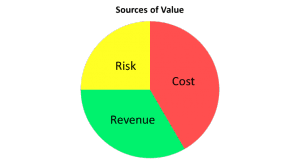 Cost differences (distinct from pricing differences). Equipment that saves energy cost, maintenance cost, labor cost or other operating costs is one example. Other examples include new hospital technology, software that automates a business process, innovative services or a new material or technology that reduces production costs.
- Revenue improvements. Innovative software solutions can help improve marketing outcomes, closing rates for sales, time to market and pricing outcomes, any of which contribute to the top-line. Innovative ingredients and materials can make new customer products and/or new customer target segments possible.
- Risk reduction. Products and solutions often reduce risk. Access to better data can reduce the risk of supply interruptions, brand-damaging events, financial losses and litigation. Software innovations and specialized services can have an impact on probabilistic events such as employee turnover, compliance breaches and enforcement actions.
When the main drivers of value creation are all primarily related to cost, this creates an opportunity to simplify value communication. But if our differentiated solution increases revenues or reduces risk, ignoring these sources of value just because they are harder to quantify or communicate is usually a mistake. It leaves money and opportunity on the table.
 Economic Value: The Most General Approach. Frameworks that consider all sources of value creation are clearly the most general. There are several similar approaches that are broad, some of which have formal, recognized names including Economic Value Estimation® (EVE®) and Economic Value Analysis and some of which, while unbranded, are just plain common sense. Without intending offense to the creators or proponents of any of these approaches, we will lump them together and refer to them as the Economic Value approach.
This approach can be characterized by: (1) its breadth of focus that includes cost savings, revenue improvements and risk reduction and (2) its natural tendency to show sources of value as differences, deltas or the financial impact of purchasing our product versus the competitor. The differences or deltas are referred to by various authors as value drivers, value stories or value word equations.
To make the math work in any Value Proposition based on Economic Value, it is critical that the units for each value driver and for each price component are the same. That way the various sources of value as well as prices can be added up to reach a mathematically meaningful net Value to Customer. When units are the same, the sources of value and prices can be displayed as a graph that makes sense.
 A waterfall or a value stack is the standard graphical display for an Economic Value approach. It is a flexible display that accommodates diverse sources of value and can accommodate negative value drivers (e.g. transition costs or costs arising from our product’s disadvantages). The Economic Value approach also accommodates a customer discussion of value without talking about price at some stages of the sales cycle. The “sell the value” conversation can be an effective setup for later conversations that include prices and value in a way that is mathematically consistent.
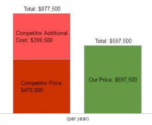
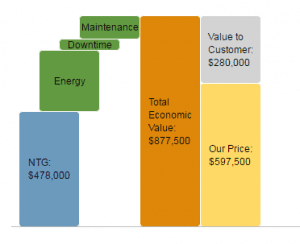 When value drivers are displayed as differences or deltas, the one choice that is often made is in how to display prices. The EVE approach to value based pricing was designed as an analytical framework that can help set our price based on value. A standard EVE graph shows the Competitor Price first, builds the value stack on top of it to get to Total Economic Value, leaving our price until last. The difference visually and mathematically between Total Economic Value and our Price is the Value to Customer.
An alternative presentation and graph choice is to display all the numbers that add up to Value to Customer or Net Savings as value drivers, differences or deltas, including the difference in outlay or spend on our 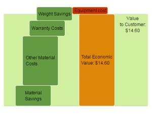 product versus the competing product. This choice is often a good choice for communication purposes when the customer is likely to consider whether to buy less of our product (however measured in weight, volume or number of units) than they buy of a direct competitor’s product. This kind of savings can be thought of as an acquisition efficiency. When savings in purchased amounts due to material savings or acquisition efficiencies are shown as a value driver, displaying and performing calculations on prices separately in the same waterfall results in double-counting.
When Does Economic Value Work Best? The Economic Value approach is a broad approach. Graphically it displays value drivers as differences that correspond directly to value-creating ways that our product is differentiated from the competitor. Economic Value is a good approach to communicating value when:
- Our product’s impact on a customer is a combination of cost improvements, revenue increases and risk reduction. Adding up sources of value that include cost, revenue and risk elements in a single graph can be confusing unless the graph adds up impacts, differences or deltas.
- Our competitive reference point is the status quo or the current approach. When the competitive price is effectively zero, the strongest messages are often those about how our product adds A side by side comparison, like a TCO graph, fails to draw attention to the value added message.
 Our communication focus is on our product’s differentiation. The Economic Value approach naturally connects a number to a point of differentiation. As a result it is a strong approach to highlighting how we are different, how we are better and what that is worth. It is the most natural approach to communicating sources of quantitative value in a meeting where a tactical aim is to avoid talking about price.
For some organizations, the Economic Value approach is the primary way to display components of summary value because their products are generally compared to the status quo or because their products create value by revenue increases or risk reductions. For other organizations that face a mix of competitor situations or create value in a variety of ways, using the Economic Value approach is a good way to standardize, so that there is a common framework for communication, regardless of the situation, to which sales and presales users can become accustomed.
 What Are Economic Value’s Weaknesses? The Economic Value approach thinks and communicates in differences or deltas. This is natural for good calculus students. Calculus starts with the math of differentials. But not all customer decision makers and stakeholders were math scholars. And visually we have all gotten used to simple side-by-side comparisons. It is no accident that weight loss commercials show a picture of before and a picture of after. The delta in those commercials is a bottom-line number and is generally not displayed graphically.
The primary challenge of Economic Value is clarity of communication. Clarity challenges arise from a variety of value sources, but they also result from an approach that presents and graphs numerical answers as differences. Sales training needs to highlight and re-enforce that value drivers show the impact of our product relative to the competitor. Good conversations about individual value drivers need to be clear about the units in which they are calculated. Showing value drivers (as differences) in the same graph as a competitor price and our price (which are not differences) takes clear explanation for audiences unaccustomed to looking at numbers this way. Deeper analytical conversations about an individual value driver in a diligence session often benefit from a side-by-side comparison as a way to keep things straight.
As a result, supplementing an Economic Value approach with other approaches that show components in side by side displays, including tables, cost comparisons and TCO where applicable, is a good way to provide sales and presales with visualization and communication options.
Total Cost: A Clear, Specific Approach. Total Cost or Total Cost of Ownership is the other clear way to summarize how customer value is created. Side by side graphical comparisons of costs with vertically stacked cost components are the standard approach. Total Cost comparisons provide clear, simple well-organized visuals. They are naturally compatible with a table display of the associated data.
 As with any graphical approach that adds components together, components of total cost must be quantified in the same unit. The visuals of a total cost graph are better when the order of magnitude of the underlying elements of the graph are broadly similar; otherwise smaller underlying cost components are often lost or overlooked. Total Cost graphs are often the best way to look at more than two alternatives at once, where side-by-side comparisons are clear and simple.
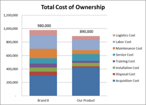 Typically a Total Cost graph will visually display the acquisition cost or pricing components of the competing alternatives as the bottom-most elements of side-by-side bars in the chart. To make the elements of the graph recognizable, this is a visual standard for most sales organizations that use the Total Cost approach. Customer audiences tend to expect prices at the bottom as well.
When Does Total Cost Work Best? Total Cost is a good approach to value communication when:
- Our product’s impact on a customer’s business is primarily to reduce cost. Many great products have their primary impact on customer costs. TCO is a clear and simple way to communicate this in many circumstances. Some customer stakeholders within an organization, including functional operating managers, are focused primarily on cost and may pay limited attention to, or be under-motivated by, revenue improvement. Total Cost visuals are simpler and clearer for conversations with these stakeholders.
- Our communicators or our audience are less sophisticated. When it applies, a side by side cost comparison is simplest and most intuitive. It requires the least training and the least reinforcement for sales teams. It requires the least explanation and minimizes confusion for customer audiences.
- Our communication focus is primarily on the details of the economic comparison. There is a point in many sales processes where some customer stakeholders want to do deeper diligence, asking tough questions about numbers and assumptions. Some value drivers are simple enough that explaining the impact of our product (a delta or a difference) on cost, revenue or risk works well for these situations. But sometimes the technical information underlying the math is detailed or complex. Often a detailed comparison of before and after will be the more natural way to walk a stakeholder through the analysis. For these conversations, whether they are about cost, revenue or risk, side by side displays help both graphically and by providing well-organized tables of numbers.
What Are Total Cost’s Weaknesses? Total Cost or TCO has its limitations as an approach. There are some situations where it applies badly or is unintuitive. There are some situations where applying it mindlessly causes a distraction or is a weak form of communicating primary messages.
- Our product’s impact on a customer is a combination of cost improvements, revenue increases and risk reduction. As previously discussed, Economic Value is broader than TCO almost as a matter of language. Organizations that only focus on TCO often fail to ask whether their
 products increase customer revenue or reduce risk. Side-by-side cost graphs can be used when there is a mixture of cost, revenue and risk value drivers by highlighting “additional costs,” as deltas or differences, on top of prices. This is a departure from ordinary language as the “costs” are what economists would call opportunity costs, e.g. revenue opportunities foregone or risk reduction opportunities missed. But this display can be a useful summary visual when used together with an accompanying Economic Value waterfall or value stack as the next step in the conversation to get into the sources of value.
 - Our competitive reference point is the status quo or the current approach. When the competitive price is effectively zero, as with disruptive technologies or new approaches, primary messages are often about how our product adds In this case, a side by side cost comparison often provides more information than the message requires. Frequently communication is more impactful when the message first highlights a problem or a business opportunity and then highlights our impact by showing how we reduce the problem or grow the business. The details of the before and after comparison can be distracting in these situations.
- Our communication focus is on our product’s differentiation. Regardless of the competitive reference point, primary marketing messages are often about how we are different, how that benefits the customer and which of those benefits are quantitatively important. TCO visuals highlight the before and after comparison and do not necessarily provide the strongest possible visual cues about the most important impacts of our product on the customer’s business. The Economic Value approach, organized by value drivers and adding up the math based on quantitative customer impacts, naturally highlights differentiation, the quantitative benefits to the customer of that differentiation and what is most important. It provides stronger visuals on the quantitative ways we create value.
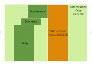
- Individual cost components may or may not support a strong summary story. The specifics of the before and after picture matter as to whether
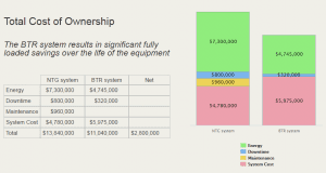
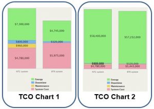 a TCO chart supports a good conversation. Consider the two examples below. TCO Chart 1 tells a clear story on the source of savings for a system with a higher price. Savings in energy, maintenance and downtime costs all contribute and are quantitatively important in that order. Qualitatively, TCO Chart 2 tells a broadly similar story in terms of the sources of value. But, because the order of magnitude of energy costs is so much greater than other elements, the visuals are less helpful in seeing or telling a clear value story. Sometimes cost charts are less useful when they have too many cost components (more than 4 or 5 components are usually too many). A cost graph doesn’t support a great story unless the underlying costs can be summarized in a few important components.
 - TMI: TCO can actually or implicitly provide too much information. The word total in TCO implies that we have fully analyzed the situation. An embedded claim that we have analyzed customer total costs is a two-edged sword. If the implication is true and we have fully analyzed customer cost, then there is frequently a lot of information that is irrelevant to the customer’s decision. While this extra information might make for a good conversation and help credentialize us with customers, the extra information is off-topic relative to the customer’s decision to buy. TMI can distract. TMI can allow or even invite customer stakeholders to lose focus. TMI can result in conversations that go on tangents, resulting in unproductive meetings. Alternatively, if we label costs total and pick and choose so that the analysis is in fact partial to be more focused, the use of a total label can lead stakeholders to wonder whether we understand their business. It can invite unnecessary and distracting debates about what we have left out of the analysis.
For some businesses with few products and specific customer cost oriented impacts, TCO can provide the right stand-alone framework. For most businesses with value selling objectives, TCO is a great supplement to an Economic Value approach to use selectively when it is applicable and when it helps to simplify and improve communication. The usefulness of Total Cost approaches should be considered on a case by case basis for many B2B sales situations.
ROI (Return on Investment). ROI has a role to play in value communication, but, it can be one of the muddier concepts for B2B sales use. Unlike Economic Value or TCO, ROI does not provide information about the sources of value. ROI relates two key numbers that should be simple and clear enough. As Warren Buffett said, “Price is what you pay. Value is what you get.” At a fundamental level, ROI is the ratio of value (“what you get”) to price (“what you pay”).
While an ROI answer seems straightforward, it is more useful in some situations than in others. ROI is a return: net economic benefits divided by outlay. Whenever a conversation relates to an investment or an upfront expenditure, it is natural to talk about return. ROI fits into that conversation when it is expressed with a clear, time-based unit, eg “per year,” “over the contract life” or “over the equipment life.”
ROI is more appropriate to the conversation when outlays, expenditures or costs chronologically precede benefits or value. When the timing of costs and benefits are roughly the same, ROI is less informative and may make little sense relative to benchmarks or hurdle rates. When significant costs arise earlier than benefits or value, the notion of a return over time provides useful information. Often related to timing differences, ROI is more relevant when the risk of realizing value (the numerator) is greater than any uncertainty associated with outlays or expenditures (the denominator).
Given the implicit timing elements of ROI, it is natural to look at ROI relative to a hurdle rate as a decision-making criterion. This is the usual finance team use of ROI where the hurdle rate relates to the cost of capital or a financing rate which in turn often reflects a risk factor. A typical ROI-based decision is to do those projects where the ROI meets or exceeds the hurdle rate.
ROI comparisons are not necessarily the best way to prioritize or rank order different projects with different outlays, timing profiles and risk profiles. It can be rational to prioritize a lower ROI alternative over a higher ROI alternative if there are smaller financial amounts at risk, shorter time horizons to breakeven or lower risks of realizing benefits.
It is often possible to calculate ROI with a deliberate aim of improving the answer. Value Proposition authors sometimes purposefully overlook the timing of outlays. They net out benefits in the numerator and outlays in the denominator to deliberately raise the ROI. Two examples illustrate how ROI calculations can be stretched:
- The timing of net outlays can be blurred by including later pricing advantages (e.g. from maintenance contracts or reduction in ongoing costs) in the denominator as a way to reduce it.
- Value and price can be blurred with value in the numerator calculated net of negative items (e.g. negative value drivers or some price components) as a way to decrease the denominator and inflate the ROI answer.
For the Value Proposition author setting up an ROI calculation, this provides the opportunity for stronger messages. For sales or presales using the Value Proposition, this results in a risk of being perceived as too slick when a careful customer challenges the calculation as a biased estimate.
ROI is natural and intuitive when our competitive reference point is the status quo, but it is subject to interpretation when facing a direct competitor. One approach to ROI relative to a direct competitor (the “Case ROI method”) takes the denominator as the total outlay on our product even though the numerator is the net value compared to the competitor. An alternative approach (“Incremental ROI”) argues that the denominator in this comparison should be the incremental outlay on our product versus the competing product. Although there are good methodological arguments in favor of Incremental ROI when there is a direct competitor, the explanation of why it is better can be complex. Complexity is usually a bad idea in sales.
 When a graph accompanies an ROI display, it provides less information about the sources of value, but it can help visually to show the value (the numerator) above the price (the denominator to provide a perspective on the magnitude of the value created relative to the amount at risk.
When Does ROI Work Best? ROI is most useful when:
- it is a supplement to other answers and displays that highlight differentiators and the sources of value
- the competitive reference point is the status quo, the current approach or no direct competitor
- the timing of outlays is earlier than the timing of value realized
- the risk of realizing value is likely to be viewed as high in comparison to the relative certainty of outlays.
What Are ROI’s Weaknesses? ROI is less helpful when:
- ROI is the only answer provided
- the competitive reference point is a direct competitor. In this situation, different ways to calculate ROI answers can result in bad decisions or introduce complexity that causes confusion.
- the timing and risk of net outlays are substantially similar to the timing and risk of value realized
- ROI is manipulated to get a better result. The more obvious the manipulation the greater the risk.
In sum, ROI comes up frequently in sales situations. Used appropriately with other information it conveys useful information. But ROI is not a universal tool and is subject to interpretation. It is a risky single focus of value communication as it misses the opportunity to center customer conversations on how our product is differentiated and how our product makes money for the customer.
 Breakeven. Like ROI, breakeven or payback is a time-related concept that conveys little information about how value is created. ROI is a rate of return. Breakeven is a time period. Definitionally, “payback” or “breakeven” is the time it takes from an initial investment or outlay to realize that same amount in value. Graphically, breakeven is usually best displayed with time on the x-axis, and costs and value shown on the y-axis.
In everyday language, ROI and breakeven are often blurred together. People who ask for “the ROI” often intend to ask for the breakeven. Breakeven is simpler and less subject to interpretation or manipulation than ROI. Conceptually, breakeven is the same when the competition is the status quo as it is when there is a direct competitor. Breakeven may be a less interesting number when there is a direct competitor (just because the timing of costs and benefits are roughly the same) but there is not the same conceptual ambiguity for breakeven that there may be for ROI.
The complex aspects of breakeven comes in thinking through the timing of costs and benefits. Showing and discussing timing with a customer can help credentialize sales by demonstrating experience with other customers. At mid to late stages in the sales cycle, this level of depth can be a useful part of diligence conversations. It often works well in conjunction with project or implementation planning discussions that are handled by presales or technical sales professionals. Early in the sales cycle, however, too great a focus on the details of timing can introduce complexity too early and cause distraction. When to have breakeven conversations should be considered carefully as the best target audience for a breakeven conversation is often a subset of customer stakeholders.
When Does Breakeven Work Best? Breakeven is most useful when:
- it is a supplement to other information that highlights how value is created
- the timing of net outlays is substantially earlier than the timing of value realized
- a sales process is in mid to later stages.
What Are Breakeven’s Weaknesses? Breakeven is less useful:
- when breakeven is the only answer provided. Not only does breakeven fail to communicate the sources of value, it also fails to communicate a perspective on the overall magnitude of value created.
- when the timing and risk of outlays are substantially similar to the timing and risk of value realized
- early in the sales process when complexity can be an impediment to qualifying accounts, getting customer engagement and obtaining a commitment to evaluate.
Like ROI, breakeven is a useful supplement to Economic Value or TCO approaches. Of all the approaches, it communicates the least information about the magnitude of the bottom line, how our product is better, and how our product creates value. Consequently, breakeven may help with “why buy now,” but it is less helpful in supporting a conversation about “why buy?” or “why buy us?”
 Useful Value Propositions for Sales. Value Propositions are more than just math. They are a communication tool, including visuals and layout, for use by sales teams in call preparation, customer conversations and presentations. They need to be designed with users in mind where increasingly customer-facing teams include both sales representatives and presales professionals.
The best B2B teams use Value Propositions collaboratively to improve B2B sales team performance, addressing sales challenges throughout the B2B sales cycle. For account executives and sales reps, they are useful early in the sales cycle in call preparation, in building sales confidence, in qualifying opportunities and in engaging customer executives. For technical sales and presales professionals, joining a customer-facing team in the middle of the sales process, Value  Propositions are an important way to address presales challenges and to maximize the impact of presales. Sales and presales teams, working together, use Value Propositions to highlight differentiation and cut through complexity as they collaborate with customer stakeholders to build a shared business case to buy. That shared business case can be used to accelerate the closing process.
Designing and publishing strong Value Propositions for sales is about more than getting the math right. It is about understanding how a Value Proposition can and will be used, designing its content, layout and graphics so that it supports customer conversations. Using it, testing it and refining it should result in continuing improvement in content, visuals and usability. The resulting Value Propositions are a shared basis for collaboration that help sales teams win.
For more information on sales use of Value Propositions see Using Propositions as an Effective Sales Tool